Designing Better HMI Applications with AVEVA InTouch
A technical article on operator visibility, ISA-101-aligned design principles, high-performance HMI practices, and AVEVA InTouch HMI modernization
In many industrial projects, HMI development begins with a simple question: What screens do we need? A better question is: What does the operator need to understand, and what action should the HMI help them take?
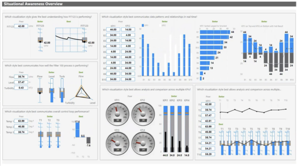
A working HMI shows information. A well-designed HMI helps the operator understand what matters.
|
● What is normal? |
● What changed? |
● What needs action? |
Why Situational Awareness Matters
Situational awareness in an industrial HMI is not only about making screens look modern. It is about helping operators understand the current condition of the process, recognize abnormal situations, identify what changed, and respond with confidence.
Operators need clarity: is the process normal, what is abnormal, what changed recently, what is the priority, which equipment requires attention, and whether the situation is improving or getting worse?
ISA-101 and Standards-Aligned HMI Design
HMI design should not depend only on personal style or the preference of one project team. It should be guided by recognized HMI engineering principles. ISA-101 is an important reference for human-machine interface practices in industrial and manufacturing applications, including screen navigation, graphics and color conventions, dynamic elements, alarming conventions, historical database interfaces, and methods used to work with alarms.
Design Principles to Emphasize
|
Clarity |
Hierarchy |
Consistency |
|
Color discipline |
Context |
Why Many HMI Applications Still Fall Short
Many HMI applications are built under project pressure. Under this pressure, the HMI can become a mirror of PLC logic or process drawings instead of a tool designed around operator decision-making. The result is an HMI that technically works, but does not fully support the operator.
|
• Too many values on one screen |
• Alarm lists without enough context |
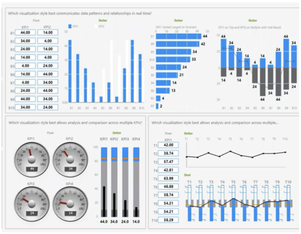
High-performance HMI: not removing all graphics, not making every display grey. It is about reducing visual noise, using color with discipline, creating clear hierarchy, improving abnormal situation visibility, and helping operators focus on what matters.
From Mimic Screens to Operator Awareness
Traditional HMI screens often try to mimic the physical process. They show tanks, pumps, pipes, valves, motors, conveyors, and instruments. This can be useful because operators need to understand equipment relationships. But a mimic screen alone does not guarantee situational awareness.
In a better HMI application, graphics should not only represent equipment. They should help the operator understand condition, priority, performance, and required response. A pump object should show mode, availability, fault state, command status, interlock condition, maintenance state, and abnormal behavior in a clear and consistent way.
Comparison Chart: From Screens to Situational Awareness
|
Old HMI Thinking |
AVEVA InTouch HMI Design |
Operator Outcome |
|
Many screens |
Clear screen hierarchy |
Faster understanding |
|
Colorful mimics |
Meaningful visual priority |
Less distraction |
|
Raw values |
Context + trends |
Better diagnosis |
|
Alarm lists |
Alarm visibility + context |
Better response |
|
Manual duplication |
Reusable templates / standards |
Easier maintenance |
|
Local-only visibility |
Web access where appropriate |
Wider operational visibility |
Engineering point: The objective is not to make the HMI look busy. The objective is to make important information stand out at the right time. Consistency should be treated as an engineering standard: symbols, colors, alarm presentation, faceplate behavior, naming conventions, navigation, trend access, and operator interaction.
Getting the Right Information to the Right Users with the Right Context
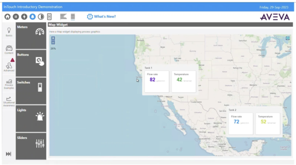
A good HMI doesn’t just display data — it delivers the right insight, to the right person, at the right moment.
That means trends that reveal what’s changing, alarms that point straight to root cause instead of adding noise, and access that adapts to how and where each user actually works. Here’s what that looks like in practice:
Trends show change
A value shows what is happening now. A trend helps the operator understand what is changing. Good HMI design makes relevant trends easy to access so operators can diagnose behavior without losing operational context.
Alarms in context
Alarms should not behave as isolated lists. They should guide attention to the affected process area, related trends, probable cause, and expected response.
Web visibility
Information access should be designed for the user role and operating context, not by simply shrinking a full operator screen onto a phone.
Practical HMI Design Checklist
|
☑ Normal and abnormal conditions are visible quickly |
☑ Critical alarms are shown in process context |
|
☑ Colors are consistent and meaningful |
☑ Similar equipment uses consistent symbols |
|
☑ Navigation moves from overview to detail |
☑ Relevant trends are easy to access |
|
☑ Reusable templates and standards are used |
☑ Screens help operators make better decisions |